I’m pretty sure that you are probably thinking that the title of this blog is about the easiest question, of course your blog is important. But let me clarify what I mean. Obviously as a business your logo is extremely important. it’s what defines your business and it’s brand. I’m pretty sure we could all point out a Chevy logo, or Toyota logo, Taco Bell, McDonalds, etc without seeing the words, right? As photographers, our logos should be the same, but as photographers a large part of advertising our business is through facebook. Should it be the only way? Not at all and it should never be considered your official website (trust me, I’ve seen it). Because we take pictures of people and post them to facebook, it’s pretty obvious that they will want to share these pictures and even make it their profile picture and often times when they make it their profile picture they will crop it one way or another, thus eliminating your logo. Is this really a big deal?
I’ve seen a lot of photographers on facebook, I think close to 10-20 of photographers I follow, include a disclaimer with their pictures along the lines of “We would love for you to share our images, but do NOT crop the pictures in any way or eliminate our logo.” Something like that. Maybe it’s just me, but often times this statement puts a bad taste in my mouth. I feel like it’s such a negative statement and almost harsh, especially since most of them capitalize NOT. It’s like I’m being punished before I even share the pictures. And so I got to thinking, is it really that big of deal of the picture is cropped or the logo is cropped out? And that led me to the question, why are the cropping picture?
I concluded that most cases a person will crop a picture simply because of the logo? Other rarer instances might be because they just want a close up picture of their face for their profile pictures. But I think more times than none it’s because of the logo. By this I mean that the logo is probably extremely busy and it’s almost distracting from the picture it’s self. Don’t even get me started on the watermarks that take up the entire picture (eek!). So again, is it really that important? This is just my opinion, but here’s my take. The person sharing or posting the picture probably likes the pictures enough that they will spread some love for you. And after posting it, they will probably receive comments, “I love this, who took these?” And they will share your name. In my opinion, these word of mouth is going to do far more than your logo stamped on the picture. If someone saw your logo, chances are they aren’t going to search you on facebook. People are lazy, this is the first thing I learned in web design, if people have to search, scroll, etc. they will not do it. But if someone shares your name with a friend, you better believe they’ll search you because now they’ve been given a reason. Better yet, why don’t you have that person tag your business name to the pictures? Then you’re just a click away?
The truth is, by putting the picture on facebook or other social network sites, you’ve got to understand that chances are it will be cropped, altered, stolen, etc. It’s the Internet and if you are so concerned about anything happening to your pictures don’t post them? You’ll spend way too much time and effort trying to police people to not alter your pictures in anyway, and I don’t know about you, but I’d rather be shooting/editing than policing. 🙂 Sure it’s a bummer when the pictures are altered, just recently I saw a couple alter my pictures through what looked like Picnik or some kind of program like that. Completely ruined the pictures, but in this case, thankfully my logo was cropped out. It could always be worse. If you are concerned about it still, and you still want to post them online, maybe you need to look at your logo and maybe that’s the reason people are cropping your pictures, I’ll give some examples below:
So obviously this first example is the busy type. Don’t hate on me, I didn’t want to spend an hour on this logo just for an example, but I’m sure you catch my drift. Super busy and it takes away from the picture.

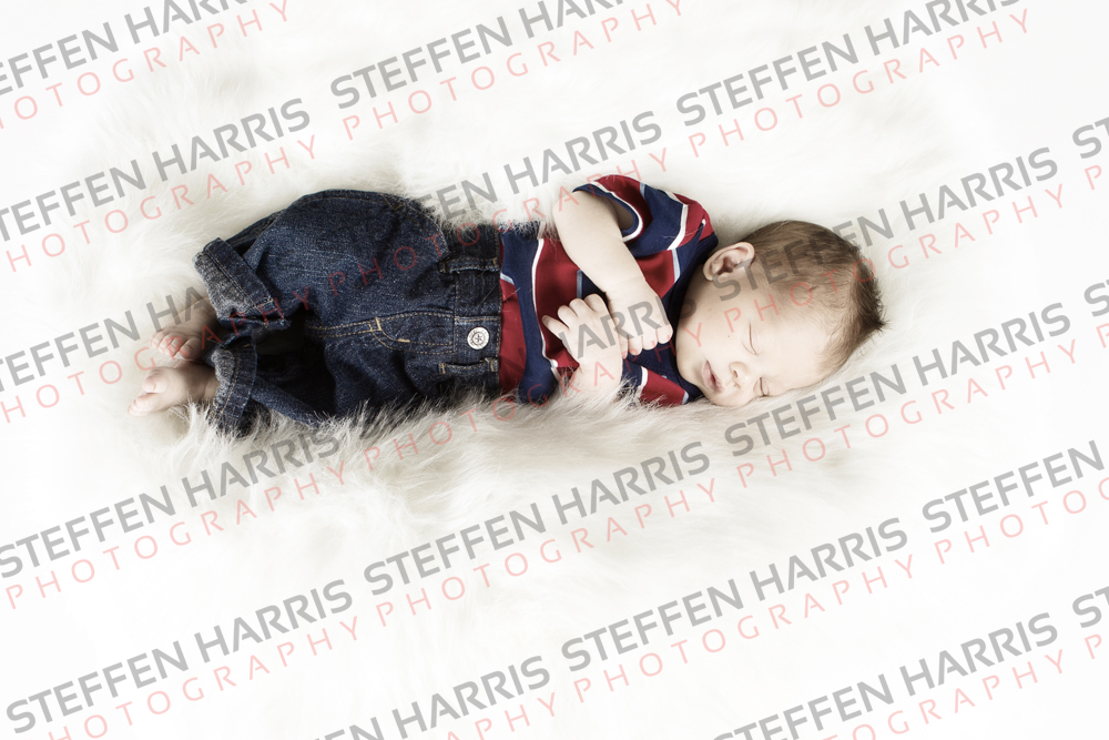
Now I’m sure this is everyone’s favorite. HA Surprisingly, I’ve seen photographers do this on facebook. Is this really a picture you expect clients to share with friends/family? I don’t know about you, but I definitely wouldn’t want that. Even if you are using online proofing? Just do a simple watermark in the bottom corner. I’m pretty sure I would rather share/order a picture that wasn’t as distracting as this.

This is what we currently use on facebook. Although, I’m pulling away from this I think. It’s not as distracting, sure it takes up a portion of the picture, but like this one and most pictures I post, it never really gets in the way. You can’t tell it on this particular picture, but the gray is a low opacity black, so when there is part of the image behind it, it’s easy to see. This is a sleeker, more modern approach to presenting your logo on your pictures.

This is the version I think we are going to be moving to soon. White background will have a faded black logo and dark backgrounds a faded white logo. Very minimalistic, doesn’t take away from the picture at all, and I think the chances of clients not altering this picture would be very low.

Anyway, this blog is only meant to give you something to think about. I’m not saying one way is right and the other wrong – that’s the great thing about this industry, if something works for you then keep it. 🙂 But if you find yourself spending more time policing facebook to be sure your name is presented on your pictures, is that really the type of branding you want to present? Just some food for though. Have a great day today.
