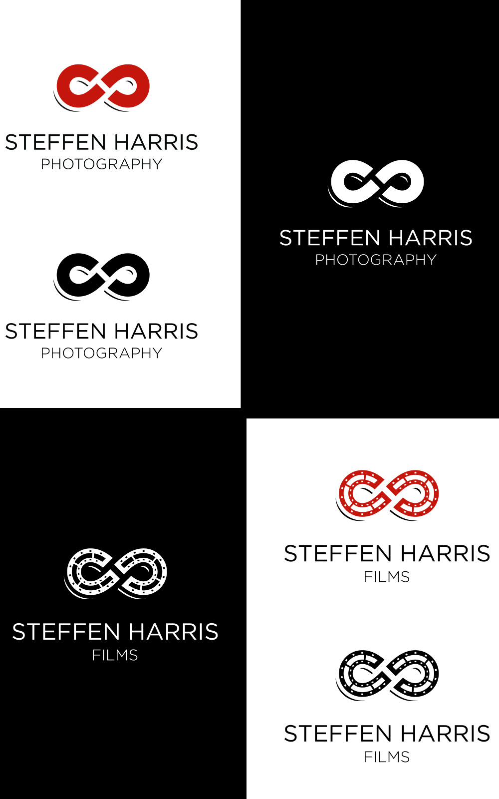
A couple years ago I had my logo created. I knew when it was made that I wanted the SH to somehow be incorporated and what was mad was an S and an H together that sort of created an infinity sign, but not too much. But the S and H were very defined. The font was a modern font, which I liked and so we ran with that for about 2 years. This year, after attending a conference about branding, I realized that my branding was not uniform. One of the questions asked during this conference was, if you lumped your pictures, business cards, logo, website, blog, facebook, writing style, etc. in a pile would someone know that it all came from the same photographer? Would your pictures line up with your style of logo? Would your business cards coordinate with your blog/website/social media? I realize that mine would not. I feel like my picture style coordinated. I have a pretty uniform look to my photography, and it’s constantly evolving – as I have said before, the only constant is change.
With all that said, I recently updated my website and my blog to coordinate, and I think it looks pretty awesome. I didn’t want a website/blog together I feel like that’s too much. I wanted people to have the option to either go to the website or the blog, plus I feel like having the two separate from each other that it helps SEO. I loved the way the website looked as well as the blog. I finally had something that I was 100% happy with. However my logo just wasn’t quite there. I liked it but I didn’t love it, I needed a graphic of some sort for my logo, not just text. I contacted a friend of mine, Jamie Kidd, a graphic designer who totally nailed the logo I wanted. I explained to her what I said above how the S and H came together to make an infinity sign, but I said that I wanted the infinity to be more defined, but I also wanted a logo that had something hidden in it, and she nailed it! The infinity sign is kind of an S and then if you look in the middle, you’ll see an H!! Too cool, I was immediately in love it with! On top of that she incorporated the same look into a films logo for me!
So everything is coming together. Logos are set, Website & Blog are set, Business card and Booklets are now coordinating. It’s a great time for our branding and I’m excited to share it with you all.

